
Back in April 2010, we have notified all our readers about the changes to the then current Google home page version.This is now being officially announced by Google and has been rolled out to the most of the users worldwide.Previously the users used to get the new version (while in testing) only when they were using Google Chrome.But now it has been expanded to other browsers as it gets official status.We are posting some of the pictures of Google’s design depicting what’s has been changed.
Official Pictures:
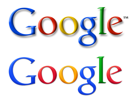
Logo design: Old Vs New
The new Google logo compared to the old one is much lighter, brighter and simpler.
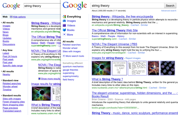
Search Options Panel:
The left Search Options Panel is now more or less a visual treat.The font size of the items has been increased and small thumbnails have been added before each item in the panel.Clicking on More search tools would expand the panel and bring in more search tools.
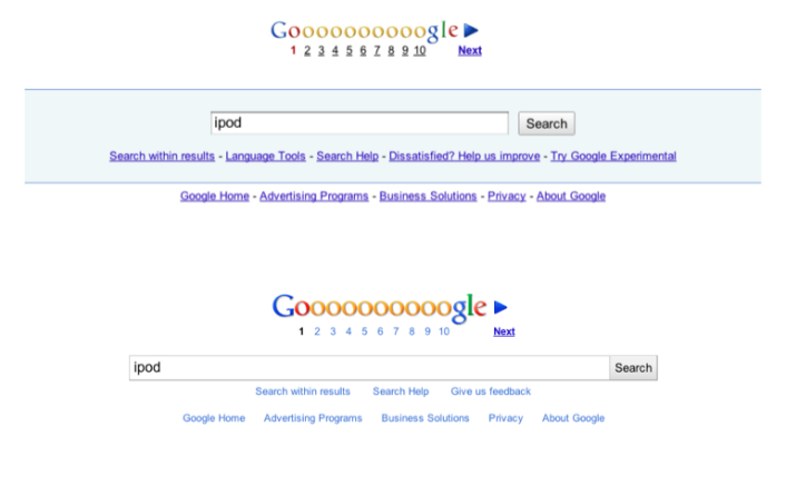
Footer:
The blue shading and the underlines under the links have been removed and the width of the search box has been increased while lightening the color.
Varying Search Options:
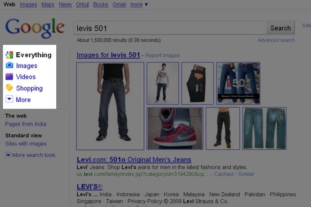
The categories in the left hand side Search Options panel would be different for different types of search queries.For instance, as shown below, the categories appearing would be different for a search query like “T20 World cup” than when you do a search for “Levis 501”.
Here’s an example of how Google search result page turns out for the above said queries.
Google would more likely return news results for these sort of sports or events related queries.
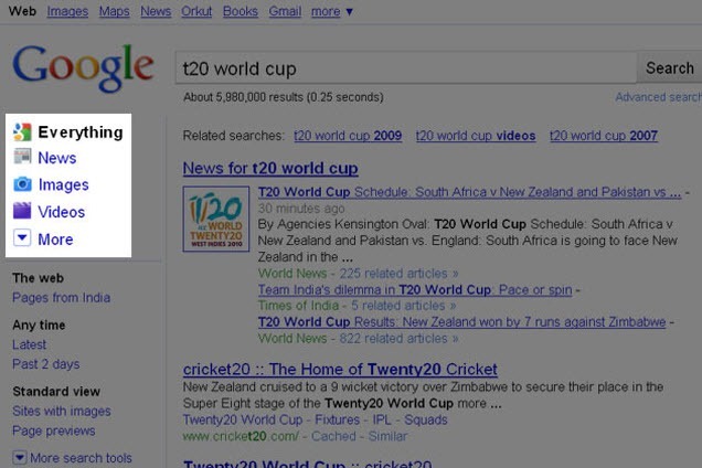
You would be more likely to see images/videos and shopping results for these sort of queries.
Do you welcome these changes? how do you feel about these new changes?
